A collection of UX case studies from my time at FourKites — spanning design systems, AI product design, navigation architecture, and customer-driven feature work — plus a look at how I actually work, from problem to production. Each one reflects real customer feedback, real product decisions, and real outcomes.
Highlighted Projects
01
Elemental Design System
FourKites' company-wide design system — a shared foundation of colors, typography, grids, and components built to unify the look and feel across the entire product portfolio.
Context & Problem Statement
Founded and built in close collaboration with Engineering, to standardize the look and feel across FourKites' entire product portfolio — replacing what had been an inconsistent, product-by-product visual language. Before EDS existed, every application in the FourKites suite looked and behaved completely differently from the next, with no reusable patterns between them. Customers who learned one application had to relearn interactions from scratch in another, driving up cognitive load for users who, in their own mind, were simply using “a FourKites app.” Without shared patterns, the product suite accumulated snowflake components — one-off elements built for a single use case that couldn't be reused anywhere else — forcing engineers to rebuild even the smallest components, down to a single button, again and again across pages. This also produced broken, inconsistent experiences: a search component might behave one way in one app and completely differently in another, so users arrived with an expectation carried over from prior use and were met with surprises when a familiar-looking component didn't behave the way they expected.
My Role
I built the Elemental Design System and have owned it since inception — auditing components, fixing accessibility and interaction issues, and keeping the library current as the product evolved. Also drove adoption by raising awareness across engineering teams and establishing a consistent process for using the system. It's still actively being built and maintained today; I continue to lead it, now alongside a small handful of engineers.
Design Strategy
EDS was built on a simple ideology: components, patterns, and user experience should be reusable and carry over from one product to the next, since to the customer it's never “this app” versus “that app” — it's just a FourKites app. Every pattern needed to work across the full portfolio, and just as importantly, needed to be easy to understand and use for our customers' typical age bracket (40+), many of whom aren't especially tech-savvy.
In practice, that meant three pillars: color (a consistent tint/shade formula derived from a primary color), typography (a single standard typeface across the whole product), and a shared layout/grid system — all built on WCAG accessibility minimums and a component-reuse philosophy.
Methodology
The system is structured around Atomic Design, Brad Frost's methodology for building interface systems out of five nested layers: atoms (the smallest functional pieces — a color token, a type style, a single input or button), molecules (simple, reusable groups of atoms, like a labeled input paired with a button), organisms (more complex, self-contained sections built from molecules and atoms, like a filter bar or a card), templates (layouts that arrange organisms into a page structure), and pages (templates populated with real content). Following this hierarchy keeps every component traceable back to its foundational building blocks and gives design and engineering a shared vocabulary for discussing the same pieces at the same level of abstraction — which is also why the library was built in phases, from foundational styles up to full components, rather than all at once.
The five stages of Atomic Design — the foundation this system's structure is built on.
Build & Rollout Process
Built in phases — foundational styles first, then input controls, then full components — including a complete migration of the design library to Figma.
New Component Request Process
Every new component starts with a request — from a designer, an engineer, or a product need that surfaces during other design work. Before building anything new, I assess whether the request genuinely justifies a new component, or whether an existing one can be enhanced to accommodate it instead, so the library doesn't accumulate multiple components doing the same job. If a new component really is needed, it goes through design, validation, and testing, then handoff to engineering, a full round of UXAT, and documentation with usage guidelines — before it's released into both Figma and Storybook.
How a new component request moves from intake to release — checked against existing components before any new build begins.
Component Sticker Sheet
A live look at the actual Elemental Design System — real interactive controls (not screenshots), built with the exact colors, type, and component specs pulled directly from the EDS Figma library, including every default/hover/focus/disabled state.
Color — Palette (600 shade)
Gray#535862
Brand#0B51B7
Error#D92D20
Warning#DC6803
Success#079455
Green Light#4CA30D
Green#099250
Teal#0E9384
Cyan#088AB2
Blue#1570EF
Purple#6938EF
Orchid#9245E2
Fuchsia#BA24D5
Pink#DD2590
Rosé#E31B54
Orange#E04F16
Yellow#CA8504
Brown#AE7F47
Color — Text & Surface
Text Primary#181D27
Text Secondary#535862
Text Tertiary#717680
BG White#FFFFFF
BG Secondary#FAFAFA
Typography — Lato
Display MD — 36/44
Display XS — 24/32
Text XL Semibold — 20/30
Text MD Regular — 16/24 (base body size)
Text SM Regular — 14/20 (hint/helper text)
Buttons — Solid
Buttons — Outline & Flat
Text Input
This is a hint text to help user.
This is an error message.
Dropdown
▾
This is a hint text to help the user
▾
This is a hint text to help the user
▾
Toggle
Live control — hover, tab to it, or click it to see the real default, hover, focus, and checked states. Second example shown disabled.
Checkbox
Live control — hover, tab to it, or click it to see the real default, hover, focus, and checked states. Indeterminate is set with JavaScript, same as it would be in product code. Third example shown disabled.
Radio
Live control — click either option, or tab through with the keyboard, to see the real selected, hover, and focus states. Third example shown disabled.
Tag (built from real EDS color tokens — exact component spec not individually pulled)
Tag label
UX Acceptance Testing
Also helped establish a formal UX sign-off step before release: every UI change was checked against its approved designs, the Elemental Design System's components and spacing, and the product's content and tone — catching visual and interaction drift before it reached customers instead of after.
Key Artifacts
An organization-wide Figma design system that I design and maintain — the single source of truth other designers and engineers use to build UI.
A coded implementation in React, Tailwind CSS, and shadcn, published to a Storybook instance so internal teams can view, reference, and consume components directly.
Internal documentation covering foundations and usage guidelines.
Impact & Outcome
Since EDS was implemented, FourKites has seen far fewer fragmented experiences and UI/UX inconsistencies, and a noticeably more cohesive look, feel, and behavior across products.
40-60% faster development: reusable, ready-to-implement components cut the time it takes engineering to ship new UI.
Stronger consistency & fidelity: standard UX patterns applied consistently across every application and page, closing the gap between design intent and what actually ships.
Fewer clicks to the outcome: streamlined common interactions so users reach the result they're after in fewer steps.
Rollout is still ongoing — EDS continues to be implemented across the remaining apps, with current work focused on adding full theming support for light and dark modes. The system continues to be actively maintained and used across every FourKites product team.
02
My Workspace
Driving Higher Engagement & Upsell Opportunities Through an Integrated Ecosystem
A scalable landing page that gives FourKites customers a daily, one-page view of performance, risk, and cross-sell opportunities across every licensed product.
Context & Business Challenge
Limited product visibility: customers were unaware of the full range of products & solutions available to them.
Missed opportunities: leadership flagged this as lost cross-sell and upsell potential.
Core challenges: siloed products prevented users from discovering solutions they already had access to; there was no bird's-eye view for executives.
The FourKites Information Architecture Structure
My Role
As Senior Designer: led solution design of the scalable Workspace landing page; partnered closely with engineering, data science, and product to ensure feasibility and timely release; personally ran validation calls with members of an Executive Customer Advisory Board — including a Technology Director of Logistics at Dow — synthesizing widget-level feedback into prioritized design changes.
Design Strategy
Reusable design library: shared components to reduce design debt.
Interoperability: dashboards link seamlessly to other licensed products.
Data at a glance: crisp, contextual summaries readable within seconds.
Role-based personalization: distinct views for executive vs. operational users.
Two Personas, One Page
Rather than one generic dashboard, My Workspace ships with two default views tuned to how people actually work — configurable further from there:
Executive: historical, high-level aggregates — on-time performance, sustainability, revenue risk, order performance, facility performance, and a global map view — built for scanning trends and deciding without digging into individual tools.
Operational: live, actionable widgets for day-to-day roles like warehouse managers and transportation coordinators — appointment-reschedule recommendations, trailer-prioritization alerts, ETA tracking, detention and stock-out risk — several of which let you act (prioritize a trailer, reschedule an appointment) directly from the widget.
Process
Validation happened in two stages: internal cross-team testing first, then live sessions with Executive Customer Advisory Board members.
Ran structured validation calls with 8 named executives across 7 companies — including TJX, Trane Technologies, Frito-Lay, Coca-Cola Consolidated, 3M, Eastman Chemical, and Dow — over a focused three-week period.
Collected feedback through a widget-by-widget rating exercise, split separately across executive and operational persona views.
Consolidated feedback into prioritized themes — drill-down by lane/carrier, share & export, international coverage, date filtering, and weather alerts were all incorporated.
A defined six-phase process governed how new dashboards were added: design discussion → wireframe walkthrough → engineering discussion → build → release → post-release monitoring, with usability sign-off required before every release.
The Executive Summary view — the same widget-level layout reviewed with Executive Customer Advisory Board members.
Impact & Outcome
Unveiled at FourKites' Visibility Conference 2023 in Chicago — became the event's highlight.
Executive usage increased 18% within three months.
46% increase in upsells; 100+ new product leads generated; first upsell closed within one month.
Executive NPS grew 32 points.
Helped reposition FourKites from "visibility provider" to "Control Tower ecosystem player."
Customer Testimonials
"The concept is great, I liked the quick access to the aggregated data... YOU GUYS NAILED IT WITH THE UI."
Laura Ensell — Technology Director, Logistics, Dow
"My Workspace has truly changed the way we interact with our supply chain data. It's become a daily habit."
Mari Roberts — VP of Transportation, Frito-Lay
"The centralised landing page having all relevant information in one place means we no longer waste time searching across different platforms."
Tom Morton — VP of Global Supply Chain & Quality, Eastman Chemical
"The flexibility to customize the dashboard based on our personas is fantastic."
Joe Garvin — Director of Global Logistics, 3M
"Having all of FourKites' offerings consolidated into a single location is a game-changer."
My Workspace unveiled at Visibility Conference 2023.The dashboard shown during the conference announcement.Live product demonstrations at the FourKites booth.
03
FourKites Redesign
Ground-up redesign of FourKites' core shipment-tracking experience.
Context & Problem Statement
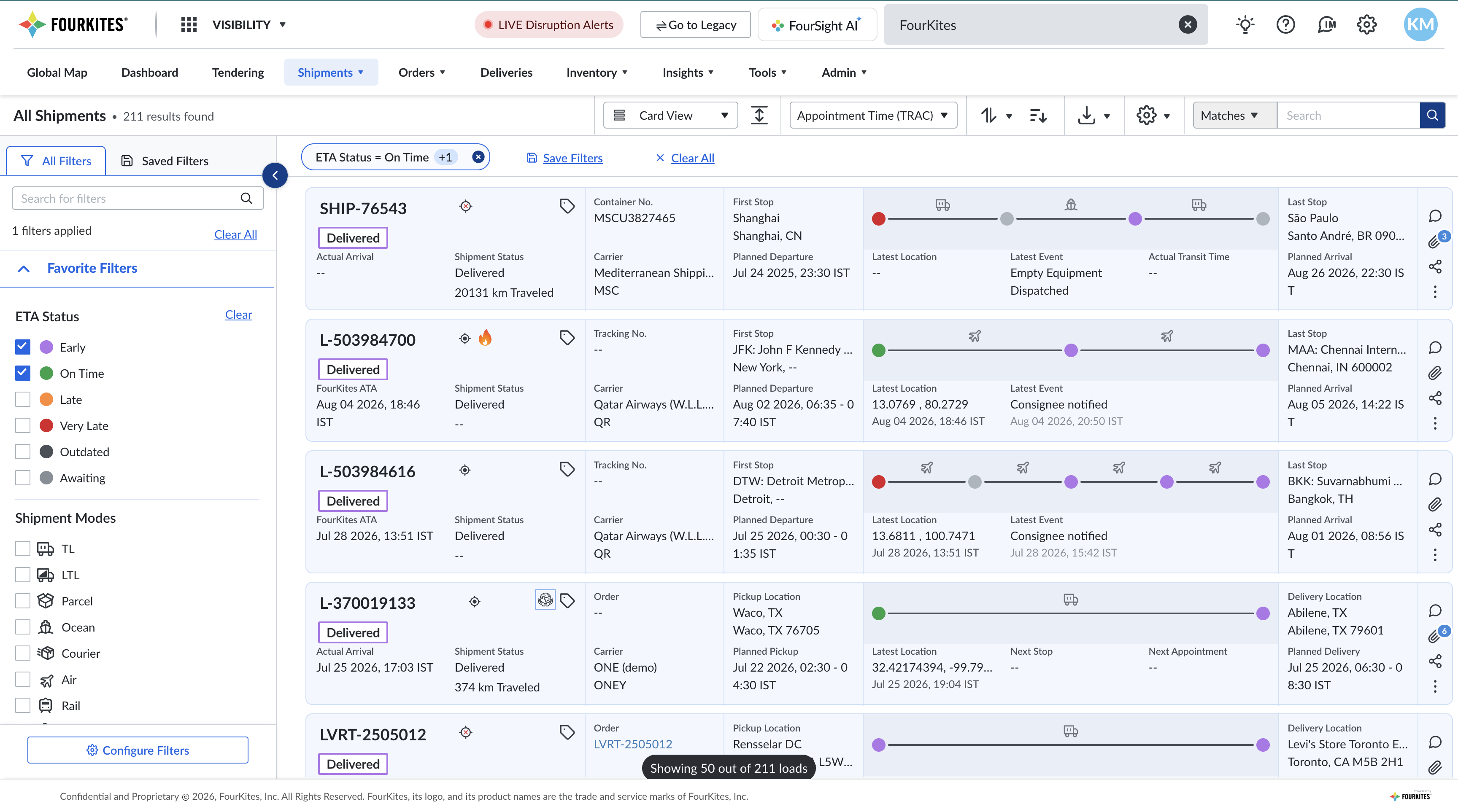
Leadership identified the need for a single, connected experience for tracking shipments across every mode of transport, replacing a fragmented set of legacy tools — and to invest in better self-service tools as the platform scaled. The initiative was scoped across six program-level areas: navigation, shipment cards, control tower, collaboration, map view, and international support. Within that, I played a major role in conception, execution, and delivery across the core customer-facing tracking experience:
Navigation: a single, extensible pattern that could support every mode — Truckload, LTL, Ocean, Rail, Parcel, and Air — plus multiple languages and white-labeling, without forking the experience per mode.
Shipment cards & list view: the existing cards treated every shipment identically regardless of phase. The redesign split shipment status into Pre-Pickup, In-Transit, and At-Stop, so each phase surfaces only the data that's actually reliable at that point — an ETA prediction on a shipment that hasn't shipped yet does more harm than good — with clearer signals on which data points are inferred versus customer-provided.
Shipments page configuration: let customers configure their own card view, list view, and filters, so the shipments page could be personalized to each team's individual use cases and scenarios rather than shipping with one fixed layout for everyone.
Shipment Details pages: redesigned the detail view customers land on from every card and search result, restructuring dense tracking, exception, and document data around the question customers actually land there to answer: where is it, and what's wrong.
Filter & filtering experience: filters were noisy, ate up a large share of the screen, and made simple things like reusing a team's saved setup unintuitive — the direct problem Saved Views (below) was built to solve.
Export experience: rebuilt how customers pull tracking data out of the platform, aligning what's exportable with what's actually filterable and visible on-screen.
Map view — shipment visibility & supplier consolidation: extended the tracking map beyond individual shipments to consolidate supplier-level visibility (fuller detail in the Global Map View case study elsewhere in this list).
Saved views: let power users bundle filters, column layout, and sort order into a single named View — covered as its own sub-project below.
Other feature releases, enhancements & bug fixes: an ongoing stream of smaller releases and fixes across the tracking experience post-launch.
(Control tower work from the same initiative is covered in its own case study elsewhere in this list.)
My Role
Led design across the redesign end-to-end — from initial concept through execution and delivery — owning navigation, shipment cards & list view, shipments page configuration, shipment detail pages, filtering, export, map view, and saved views, plus a steady stream of feature releases, enhancements, and bug fixes post-launch. Worked directly with enterprise customers — including SC Johnson, Henkel, and others — to validate designs and resolve real-world issues as they surfaced.
Design Strategy / Process
A mix of net-new feature design — Saved Views, Export, the filtering overhaul — and component-level audits against the design system for existing surfaces, with fixes prioritized by customer impact and increasingly supported by AI-assisted development to ship faster (see Vibe-Coding with Claude, below).
Search & Discovery
Filters were noisy, ate up a large share of the screen, and made simple things like reusing a team's saved setup unintuitive — while the search box had quietly become a workaround for filtering limitations it was never meant to solve. Saved Views, below, was the direct response to that gap.
Before & After
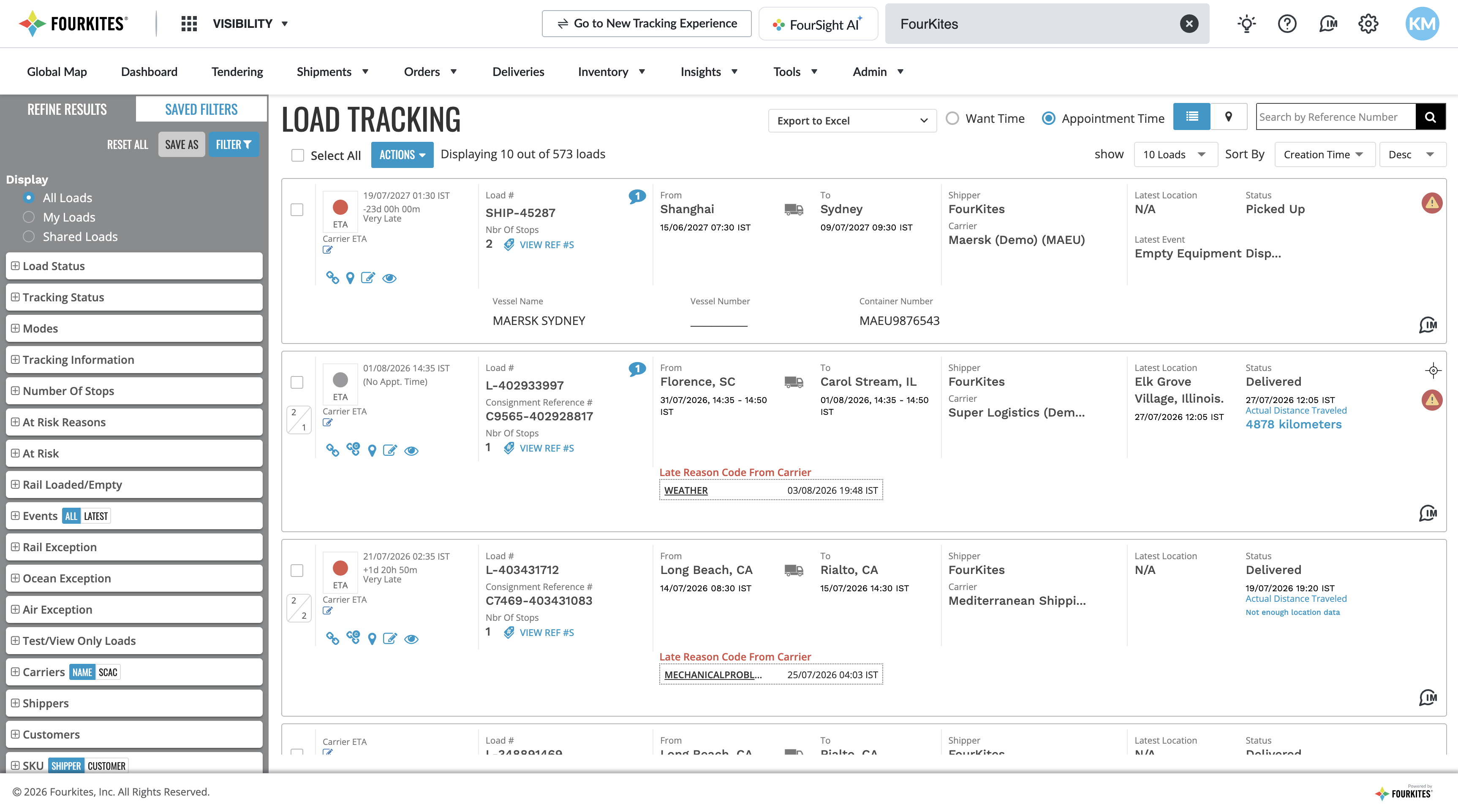
The redesign replaced a dense, one-size-fits-all shipment list with the phase-aware experience described above. Drag the handle to compare the classic FourKites tracking UI against the redesigned one.
BeforeAfter
Classic FourKites tracking UI (left) vs. the redesigned experience (right) — drag to compare.
▸ Sub-project
Saved Views
Letting power users bundle their filters, column layout, and sort order into a single named "View" — built directly from a customer's idea.
Context & Customer Signal
The idea originated from a customer request submitted through FourKites' community idea exchange: "Filters with Column Headers Saved," submitted by Amber McMillian of Bridgestone Americas, which gathered strong support from other customers. She had actually raised a related need years earlier — suggesting this was a long-standing pain point before it finally got built.
My Role
Took this from a raw customer idea through to a fully specified feature — writing the problem statement, proposed solution, and seven detailed user-story flows with acceptance criteria.
Design Strategy
Personal, not shared (v1): Views scoped to the individual user.
List View only (v1): Card View out of scope for the first release.
Non-destructive exploration: temporarily tweaking a filter doesn't alter the saved View — a subtle indicator shows the change, with one-click reset.
Explicit Edit Mode: updating a saved View requires deliberately entering an edit state, with a safeguard against accidental changes.
Impact & Outcome
Currently in development, not yet released to customers.
Photos
Photos
04
FourKites AI — FourSight AI
FourKites' AI assistant — from a contextual sidebar chat to a full-page data-explainability experience.
Context & Problem Statement
The prior landing-page experience packed in many separate dashboards, requiring users to navigate complex menus and filters just to find relevant information — creating high friction for new users. FourSight was designed to pair a conversational AI assistant with clearer, more guided data exploration.
My Role
Wireframed and designed the initial concepts — evolving the product's requirements from an AI-powered chatbot into a full-fledged application with a standalone page and insights experience.
Defined how each component, state, and interaction should look and behave.
Worked with engineering to get the designs properly built, running UXAT and driving feature enhancements.
Design Strategy / Process
Iterative usability testing cycles: refining the transition from a sidebar chat to a full-page view, adding conversation history, and improving in-product search.
Product Capabilities
FourSight AI is FourKites' conversational analytics assistant — instead of digging through dashboards, menus, and filters, users ask a question in plain, natural language and get back an answer complete with the underlying metrics, deeper analysis, and a chart or visualization where relevant. It supports 24 languages, so global teams can work with it in their own language rather than translating queries into a fixed report format.
The experience spans two tiers. The free tier handles day-to-day shipment questions — status lookups, natural-language filtering across carriers, customers, and lanes, and disruption/risk queries — answered off real-time shipment data, plus general platform how-to questions from the knowledge base. The premium tier extends that same conversational layer across orders, inventory, yard operations, and appointments, adding predictive analysis and deeper historical, cross-module reporting.
A typical question looks like "Which carriers have the most loads running late right now, broken down by carrier?" or "Show me all delayed shipments going to California this week." The system classifies each question's intent behind the scenes, routing it to the right data source and tier automatically — the user never has to know or choose which system is answering.
▸ Sub-project
Generative UI (GenUI)
FourSight AI's newest capability — building the interface itself, in real time, based on what a user actually asks for.
My Role
Designed the experience — the features available, the outcomes it delivers, and how it behaves.
Defined how each flow works, based on the customer's query.
What It Is
Generative UI (GenUI) is FourSight AI's newest capability. Rather than a developer hard-coding every screen ahead of time, an AI model constructs the interface itself, in real time, based on what the user is actually asking for — adapting the layout, components, and data visualization to the specific request instead of forcing the request to fit a fixed, pre-built screen.
How It Works Under FourSight
Under FourSight, GenUI can generate dashboards, views, tables, reports, charts, widgets, and layouts on demand — or, for a simpler question like "Where is my shipment?", just answer directly with the relevant data. Whatever a user asks, FourSight intelligently classifies the intent behind it and builds the right output in real time, whether that's a piece of data, a chart, a widget, or a full layout.
The conversation doesn't stop once a view is generated — users can keep refining it, asking FourSight to change a chart type, add or remove a widget, adjust a filter, or explain how a specific number was derived. A generated view can also be saved and reopened later, refreshing with current data rather than showing a frozen snapshot from when it was first created.
Design Principle: Real Data, Never Guessed
A core design principle behind GenUI: the AI only ever decides what to show and how to lay it out — never the underlying numbers. Every value in a generated view is pulled directly from live data, so nothing is fabricated or approximated to fill a gap; if the data isn't available, a widget simply stays empty rather than showing a guess.
Impact & Outcome
The result is a UI that's effectively customized to each individual user, without routing every new page, dashboard, report, or layout through the usual design-and-build cycle — a process that's normally slow and resource-intensive to repeat for every use case.
Status: currently in active development, with a general availability date already planned per internal product documentation — not yet released to customers.
Known Limitations & What's Next
Today, FourSight AI's deeper analytics are scoped to shipments and orders — inventory, assets, appointments, and yard management aren't yet covered, though they're on the roadmap. The longer-term vision is to connect FourSight AI to FourKites' broader agent network, so a conversational query doesn't just return a report — it can trigger an action, like having an agent confirm an updated ETA with a carrier or reschedule an appointment automatically.
Impact & Outcome
FourSight AI went generally available in November 2025 and is now live with 400+ enterprise customers, drawing on a network that tracks 3.2 million shipments a day. The pitch: think of it as a "Bloomberg Terminal for supply chain" — pairing each customer's own operational data with that broader network intelligence to turn a conversational question into a strategic, predictive answer.
Photos
05
Address Manager
Address Manager — UX Audit & Redesign
A full usage audit and end-to-end redesign of one of FourKites' most heavily used tools — grounded in real product analytics, not just a visual refresh.
Context & Problem Statement
Address Manager stores every stop address a shipper uses — pickup, delivery, and yard locations — and lets customers define the geofence around each one, which FourKites uses to detect arrivals and departures. It's one of the most frequently used tools in the product, but the existing table-style layout packed dense, low-contrast rows of data with no clear signal for which addresses actually needed attention.
My Role
Owned the redesign end-to-end: ran a full usage audit of the existing tool (engagement time, feature-level click data, and task flows), defined the UX goals and success metrics for the initiative, and proposed a new card-based interface built on the Elemental Design System.
Usage Audit
Before redesigning anything, I pulled real usage data to see how customers actually worked in the tool:
Users spent an average of 6m 31s per day in Address Manager, with Unilever North LATAM the single heaviest user at over 7,000 views in a 180-day window — alongside high-volume customers like Dow Chemical, Averitt Express, Penske Managed Transportation, and Niagara Bottling.
Feature-click data showed viewing card details overwhelmingly dominated every other interaction — dwarfing search, custom geofence editing, and version history combined — meaning the list view's main job was simply getting people to a single address faster.
Mapping the task flow (add address, edit address, export, view statistics) showed most journeys funneled through the same handful of actions, which became the basis for what the new card layout needed to surface up front instead of hiding behind a click.
UX Goals
Two goals anchored the redesign, each tied to a measurable target:
Reduce time spent managing addresses — from a baseline of 9.75 minutes to a target of 8.8 minutes per month, by surfacing the right information without extra clicks.
Increase adoption of FourKites' recommended geofences — from a 24% baseline to a 70% target among shippers with a recommendation available, since geofence accuracy directly drives tracking reliability.
FourKites Recommended Geofence
A core piece of the redesign: instead of leaving customers to hand-draw and guess at geofence shapes, the tool recommends a better-performing geofence based on that customer's own history at the location, or the best-performing geofence used by other shippers at the same site across the FourKites network. On individual addresses tested, activating the recommended geofence improved entry-success accuracy by roughly 11–13% over the existing custom shape.
Proposed Design — Card View
Replaced the dense, low-contrast table with a scannable card grid: each address card surfaces its geofence entry-success rate as an at-a-glance ring, shows whether a better-performing recommended geofence is available with a one-tap Activate action, and exposes the connected services (EDocs, Yard Connect, Appointments Manager) as inline toggles — removing the need to open a record just to check or flip a switch.
Impact & Outcome
The audit gave the team a real baseline to design against instead of guessing, and the recommended-geofence work showed measurable accuracy gains on individual addresses. It also reinforced validation from elsewhere in Address Manager — Fast Track, a related tracking-reliability feature, has strong customer results:
"The week after implementing Fast Track we were tracking at 88%... we achieved multiple weeks of 100% tracking in a row."
Carrie Conrad — Land O'Lakes
Photos
06
Unified User Management System
Unifying three fragmented per-product user-management systems into a single, consistent experience.
Context & Problem Statement
Each FourKites product had evolved its own user-creation model, meaning the same person could need separate accounts across products, with no shared view or bulk management. The fix: a single unified user list, one creation flow, and clearly organized permission settings per product.
My Role
Led the UX for unifying the experience, from early concept wireframes shared with the broader team through to final usability testing.
A self-service onboarding tool that replaced a slow, manual carrier-network setup process with a three-click flow.
Context & Problem Statement
Previously, connecting a shipper to a new carrier required manual setup by an administrator, plus separate backend credential configuration — a slow process with long customer wait times. Self Onboarding replaced this with a simple three-click flow: pick a carrier, enable tracking, and go.
My Role
Responsible for the UX design and live presentation of this feature at a company-wide product demo day, including building the Figma prototypes and recording the feature walkthrough. Ran pre/post-launch Pendo metric analysis on two of the flow's key pages — the Carriers Sign-up page and Carriers List page — to validate impact and prioritize the next round of improvements.
▸ Sub-project
Carriers Sign-up Page
A two-stage funnel fix — from carrier invite email to the sign-up form itself — that lifted page visits 4–5X and account creation 286%.
Study Methodology
Pendo Metric Analysis of the carrier self-service sign-up flow, comparing Jan–Mar 2023 (baseline) against Apr–Jun 2023, following a sign-up page update shipped in April 2023.
How the Flow Starts
A carrier receives an email invite from the shipper they work with (e.g. "Magellan Transport Logistics is requesting to connect with you via FourKites"), covering who FourKites is, the platform's benefits, and its data policies. A "Join FourKites" button in that email leads directly to the self-service sign-up page.
Problem 1 — Low Click-Through
Most invited carriers never proceeded past the email: only an average of ~300 visitors/month clicked through to the sign-up page (Jan 207, Feb 334, Mar 427). Working hypotheses: carriers didn't know enough about FourKites to bother clicking, or were already using a competing platform.
Solution 1 — Lead with Brand & Benefits
Rebuilt the invite/landing experience to inform rather than just prompt — leading with a "Why Join?" benefits list (save time, improve customer service, reduce dwell time, validate detention claims) and an explainer video, instead of a bare logo and button.
Result 1
Visitors to the self-service sign-up page jumped to as high as 2,691 in April, settling around 1,000–1,600/month through May and June — a 4–5X increase over the pre-update baseline.
Problem 2 — Drop-off at Sign-up
Of the carriers who did reach the sign-up page, many still didn't complete it. Working hypotheses: carriers didn't trust the platform, or had privacy concerns about the data being requested.
Solution 2 — Build Trust at the Point of Sign-up
Personalized the form with the requesting customer's name and company (making the ask feel specific rather than generic), restated the benefits directly on the form, and added the explainer video — reinforcing legitimacy at the exact moment carriers were deciding whether to hand over information.
Result 2
Accounts created grew to roughly 1,000/month, a 286% increase quarter-over-quarter — from 794 sign-ups in Q1'23 to 3,067 in Q2'23.
Conclusion
Both problems traced back to the same root cause: carriers' lack of trust in and knowledge of FourKites, which suppressed click-through and completion at every stage of the sign-up funnel. Adding trustworthy elements — customer/company personalization, benefit messaging, and an explainer video — at both the invite and the form fixed it.
▸ Sub-project
Carriers List Page
Pendo metric analysis on an information-hierarchy redesign of the carriers list page.
Increase feature usage and reduce the time taken to absorb information on the carriers list page.
Solution
Rebuilt the page around a proper information hierarchy — clearer grouping plus actionable CTAs and recommendations in place of raw, undifferentiated data.
Key Results
Total users grew from 150 in Q4'22 to 481 in Q1'23 — a 220% increase in user visits.
Time required to understand the information dropped from 10 minutes to 7 minutes — a 30% reduction.
Number of clicks needed reduced to a single click.
Photos
08
Developer Portal
Design contributions to FourKites' Developer Portal, the self-service hub for partners and customers integrating with the FourKites API.
My Role
Shared UX ownership within the design team for a set of new application features on the Developer Portal.
Photos
09
Intelligent Control Tower
A unified navigation shell and digital-worker command center, consolidating FourKites' previously fragmented product apps into one cohesive experience.
Context & Problem Statement
The Intelligent Control Tower combines supply chain visibility, AI automation, and predictive analytics — moving FourKites from passive visibility toward automated execution, powered by AI "digital workers" for supplier operations and shipment tracking. Previously, FourKites' web experience was a set of separately deployed apps, each maintaining its own copy of shared navigation; ICT consolidates these into a single, cohesive product.
My Role
Served as the UX reviewer for the ICT Supplier Connect landing page and its context-aware map view, working closely with engineering and product teams. Defined detailed UI rules for visualizing ranked carrier recommendations, and contributed to a broader navigation redesign consolidating the product into a more unified structure.
Design Strategy / Process
Established consistent design rules for light and dark themes, including shadow, outline, and interaction states for map controls, and a structured design-to-development handoff process.
A purpose-built map experience for supply chain visibility, redesigned from the ground up after its original version failed to earn its place next to the list view.
Context & Problem Statement
An internal review of the original map view found that it simply plotted the same data shown in the list view, with no clear problem of its own to solve. The redesign asked a different question: what could a map show that a list never could — leading to a purpose-built experience layering in risk, weather, and points of interest rather than just repainting the list in a different shape.
My Role
This is the same underlying work referenced in the Intelligent Control Tower project above — the current, supplier-focused evolution of Global Map View.
Design Strategy / Process
Early design principles — showing only the most important shipments, a "zoom to drill down" interaction model, and layered points of interest — carried forward into the current iteration's theme-consistency and legend-clarity work.
Key Artifacts
Same Figma files as the Intelligent Control Tower project above.
Photos
11
Booking Connect
FourKites' lightweight, faster-to-implement Transportation Management System, spanning LTL, Parcel, Ocean, and Air booking.
Context & Problem Statement
Booking Connect centers on AI-generated rate recommendations and initiating a booking directly from an existing order — covering booking requests, contract rates, routing guide compliance, required documentation, and configuration, all in one place.
My Role
Owned usability testing and design fixes across all Booking Connect modules, working closely with the product team to resolve interface issues.
Photos
How I Work
12
Vibe-Coding with Claude
An AI-native workflow for turning customer-reported issues into shipped production fixes — end to end, owned solo.
Context & Problem Statement
FourKites customers report issues and ideas through a public community forum. Turning that feedback into a shipped fix traditionally means routing it through several teams and a backlog. This project is a faster, more direct path: going from customer request to a reviewed, shipped fix myself, using Claude as a coding partner.
My Role
Own the full loop end to end, solo: monitor and analyze customer requests, diagnose the real problem, decide the right fix, build it using Claude, review it, and ship straight to production. A few real examples:
A customer on Unilever's North LATAM team asked to filter by multiple carrier codes at once instead of one at a time — a request with strong support from other users. The fix shipped directly to production.
A customer at BRP asked to add a "watcher" to multiple shipments at once instead of one by one. Before building it, usage data was pulled to confirm real demand — the existing single-shipment version was barely used, while a similar bulk action elsewhere in the product was used constantly, confirming the gap was the missing bulk option, not low interest. The fix shipped shortly after.
Reviewed and refined a teammate's AI-assisted fix for a shipment status indicator, contributing UX constraints before it shipped.
Additional community-requested fixes have shipped this way for customers at Cargill and Direct Roots.
Process
Analyze incoming customer requests via the community forum
Diagnose the real problem — often backed by usage-data analysis
Decide on the right fix/approach
Build the fix directly using Claude (or review a teammate's AI-assisted fix)
Review the change
Ship to production
Design Strategy / Approach
Currently exploring ways to make this process even more efficient — including exporting the design system as structured design tokens, which can reduce AI token usage by roughly 70% while keeping generated UI consistent with the design system.
Several customer-requested fixes have shipped this way so far, each resolving a real, validated customer need.
Photos
13
My Design Process
How I take an idea from a raw problem to a shipped product — before AI was part of my workflow, and after.
Context
Over 10 years as a Senior Interaction Designer, I've relied on the same repeatable process to move from an ambiguous problem to a released feature: discover, diagnose, ideate, validate, build, ship. That shape hasn't changed. What has changed is how fast I move through it, now that AI is a working partner in my day-to-day practice rather than a tool I reach for occasionally. This project lays out both versions of that process side by side.
Interactive Process Map
Click any phase to see its actual steps, pre-AI vs AI era. The bars below show illustrative time per phase — shorter is faster, not fewer steps.
→→→→→
AI-assisted in the AI era
Time taken (illustrative)
Pre-AI
AI era
Click any phase above to see its steps, pre-AI vs AI era.
Full Step-by-Step Reference
The complete process, phase by phase — 13 steps before AI, 12 steps now.
02Understand root cause & customer pain points, aided by AI analysis
Ideate
→
03Leverage AI to research & generate solutions
Validate
→
04AI-generate lo-fi prototypes
05Review the AI artifact with UX & Product
06Iterate on feedback with AI, until approved
07AI-build a hi-fi prototype in the design system
08Gather feedback from stakeholders & customers
Build
→
09Create engineering handoff specs
10Hand over designs & assets to Engineering
11Run UXAT with engineering, fix issues
Ship
12Sign off & release to production
AI-assisted step
What Actually Changed
Speed of exploration: solution research and lo-fi prototyping compressed from a multi-day effort into a single working session.
More shots on goal: because early-stage output is cheaper to produce, I can explore more solution variants before committing to one, instead of anchoring early on the first idea that felt workable.
Earlier, higher-fidelity conversations: stakeholders and customers now react to something close to a real hi-fi prototype much sooner in the process, instead of a hand-sketched lo-fi wireframe — sharpening feedback earlier.
Same rigor where it matters: problem discovery, root-cause diagnosis, internal sign-off, customer validation, engineering handoff, and UXAT are unchanged — AI sped up production, not judgment.
My Role
I own this process end to end on every project I lead — from the craft-driven version I built over the first several years of my career to the AI-augmented version I use today — including deciding where in the process AI actually earns its place, and where hand-craft and human judgment still matter more.
Impact & Outcome
The result isn't a shorter process — it's a faster one, with more room in the same timeline for iteration and validation instead of production. The Vibe-Coding with Claude project (above) is the natural extension of this shift: taking the AI-assisted version of this process all the way through to shipped code, solo.
14
UX Acceptance Testing (UXAT)
A structured quality-assurance process ensuring every UI/UX change gets a designer's sign-off before release — replacing an untracked, spreadsheet-based bug backlog with a clear, prioritized workflow.
Context & Problem Statement
Features regularly shipped with UI issues — some simple, some complex — that went unfixed for a long time because they were categorized as low-priority. These "minor" bugs were a persistent source of friction for users.
There was no dedicated system for tracking UX bugs and defects. Most were tracked in a spreadsheet, which gave the product team no real visibility into what existed or its status.
Prioritizing these issues was difficult without that visibility, and they often sat in the backlog indefinitely.
My Role
Contributed input during the process's creation, which was primarily designed by another member of the UX team. Since its rollout, I've been one of its strongest advocates in practice — none of my own design work ships without going through a full, rigorous round of UXAT.
Design Strategy
Every UI/UX-impacting change is checked against three things before it can ship:
End-to-end design flow & use cases: does the shipped feature match the signed-off design screens, user flows, and responsive behavior?
Design system compliance: does it correctly follow the design system's components, typography, spacing, layout, resolution, and color guidelines?
Content & language: consistent tone and correct copy across labels, menus, error messages, and CTAs — including spelling.
Process
A mandatory "Is UX needed?" field was added to every ticket, flagging whether a change has any UI impact.
If flagged, the UX team is notified automatically once code is pushed for review — so UX review happens alongside code review, not as a later afterthought.
The mandatory "Is UX needed?" field added to every ticket, flagging UI impact right at intake.
Once QA is complete, every UI/UX-impacting ticket moves into a dedicated UXAT stage in the workflow.
A UX team member reviews the feature against the criteria above:
If it meets expectations, it's marked approved and moved to "Ready for Release."
If it doesn't, it's sent back to development with specific issues flagged, to be resolved before the sprint ends.
The dedicated UXAT lane in the ticket workflow, sitting between QA and Ready for Release.
If a UX bug is later found in staging or production, it's logged as a formal defect — tagged as a design/implementation miss — rather than left untracked, and prioritized directly with product and engineering during sprint planning.
The process also includes participating in Shift Left Testing — proactive QA collaboration sessions aimed at catching defects earlier in the delivery cycle, before they reach later stages.
Logging a UX bug as a formal defect — tagged "Design/Implementation miss" under Source of Issue.
Impact & Outcome
Replaced an invisible, spreadsheet-based bug backlog with a tracked, prioritized workflow built directly into the existing ticketing system, giving the product team real visibility into UX-specific issues for the first time.
New features and releases now align closely with what the UX team actually designs and hands off to engineering.
UI/UX issues are caught early, before they ever reach customers.
The process also surfaces technical limitations during review, letting the team redesign solutions that work better within real platform constraints — rather than discovering the mismatch after release.
Component states, interactions, and edge cases that used to get missed during implementation — often due to other interfering code elsewhere in the platform — are now caught before shipping to production.
Design-to-code fidelity improved significantly: before this process, engineering's output rarely matched what UX designed and handed off, tracking at roughly 60% visual and behavioral alignment. Since UXAT became standard practice, that alignment has risen to over 90%.